Skills
UX DESIGN / PROTOTYPING /RESEARCH / CLIENT WORK
Platform
Desktop-first
My Role
Lead UX Researcher and Designer – Analyzed both qualitative and quantitative data from stakeholder and user research to inform the design of high-fidelity prototypes in Figma.
Collaboration with
3 User Experience Designers and Computer Scientists
OVERVIEW
OUR TASK
How might we improve the overall experience of the TechSmith help center?
This question formed the foundation of our project. Our goal was to explore how the support page could evolve to meet user expectations and simplify navigation. We combined stakeholder interviews, comprehensive user research, and detailed analysis of quantitative data to uncover key insights and identify areas for meaningful change. Our mission was to transform those insights into an improved, user-friendly support experience.
THE PROBLEM
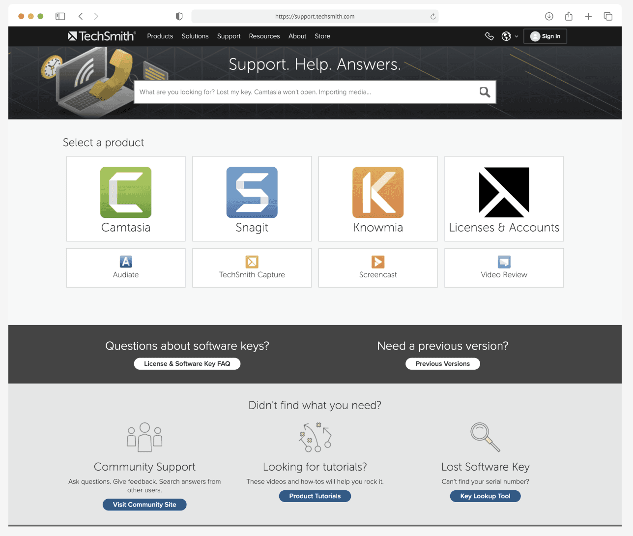
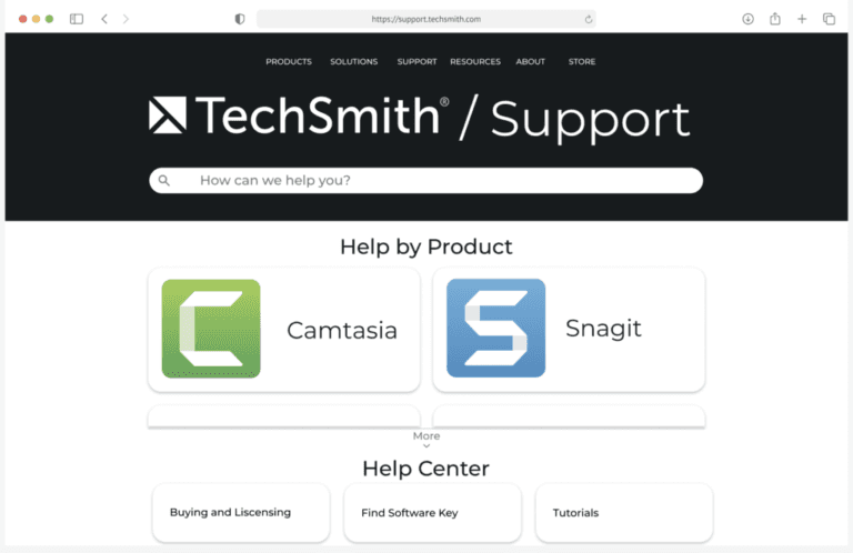
TechSmith's help center was difficult to use and falling short of modern standards.
The site’s design was outdated, navigation was confusing, and its organization left users frustrated. Given TechSmith’s broad global audience spanning up to seven languages, creating a clearer and more accessible experience was vital. We began by focusing on the English version, the most widely used, which set the benchmark for the redesign. The Key Issues we uncovered from a combination of stakeholder interviews, user research, and personal evaluation of the support page were as follows:
Outdated Design and Navigation: The interface lacked intuitive paths, forcing users to take extra steps to find essential information.
Cumbersome Product Unlock Process: Users faced consistent frustration retrieving and using software keys.
Lack of Product Hierarchy: The front page displayed products without clear prioritization, making it difficult for users to identify and access core offerings like Camtasia and Snagit.
Outdated and Inconsistent Interface: The help center's design didn’t align with TechSmith’s current branding, creating inconsistency with their other pages
OUR SOLUTION
Lets revamp the help center to provide a more intuitive, user-centered experience
To do this we focussed on:
Enhancing Navigation and Simplifying Information Architecture: Streamlined content organization for clearer navigation paths, ensuring a seamless user experience. This included simplified steps, more intuitive headings, improved iconography for better accessibility, and support for non-English speaking users to ensure a frustration-free journey.
Prioritizing Core Products: Emphasized Camtasia and Snagit due to their importance as the primary products with the most site traffic.
Refreshing the Visual Design: Developed a sleek, modern aesthetic to enhance visual appeal and user engagement.
PROCESS
Understanding Current Challenges
We began with interviews with two TechSmith representatives to identify key pain points. To deepen our understanding, we conducted a survey targeting TechSmith’s primary audience—tech-savvy users who frequently accessed the support page. As a team, we also conducted a “Black Hat” session and a CRAP Principles analysis (Contrast, Repetition, Alignment, and Proximity) to identify usability and design flaws. Additionally, our analysis of website traffic data highlighted high-traffic areas, such as installation guides and product version history. This insight shaped our design focus, ensuring these areas were prominent in the redesign.
Defining Core Issues
Through our evaluations, we identified key pain points that were consistent across stakeholders, users, and our team, providing us with a clear understanding of how to improve the support site. The key findings were as follows:
Outdated and Inconsistent Interface: The help center's design lacked a modern visual identity that didn’t align with TechSmith’s current branding, creating inconsistency with their other pages
Lack of Product Hierarchy: The front page displayed products without clear prioritization, making it difficult for users to identify and access core offerings like Camtasia and Snagit.
Navigation Struggles & Failed Help Searches: Users faced issues with finding relevant information since the interface lacked intuitive paths. This forced users to take extra steps to find essential information, and many encountered dead ends, not able to find the support they needed.
Cluttered Interface & Inconsistent Design: The interface was disorganized, with inconsistent graphics, icons, and a dull color scheme that created confusion.
Accessibility Issues: Low contrast between text and background hindered visibility for some users.
Layout & Alignment Problems: Misaligned headings, buttons, and inconsistent navigation elements disrupted the user experience.
Prototyping
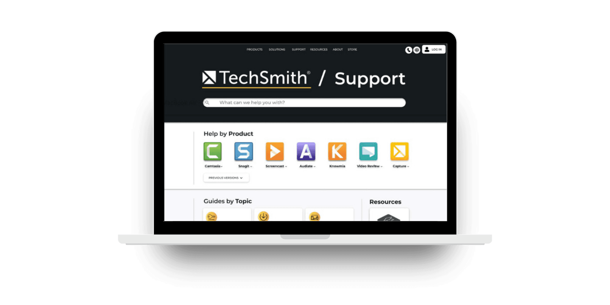
With clear concerns outlined, we began ideation and created low-fidelity wireframes. I then led the translation of these into high-fidelity prototypes using Figma, emphasizing:
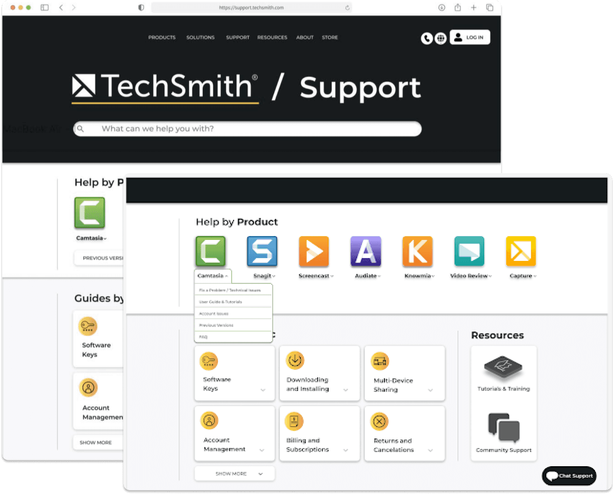
Highlighting Core Products: Positioned Camtasia and Snagit prominently for easier access.
Brand Colors: Introduced vibrant, branded colors to replace dull grays.
Modernized Design: Adopted a minimalist aesthetic for a fresh look.
Visual Cohesion: Aligned buttons and headings for an organized layout.
Testing & Iterating
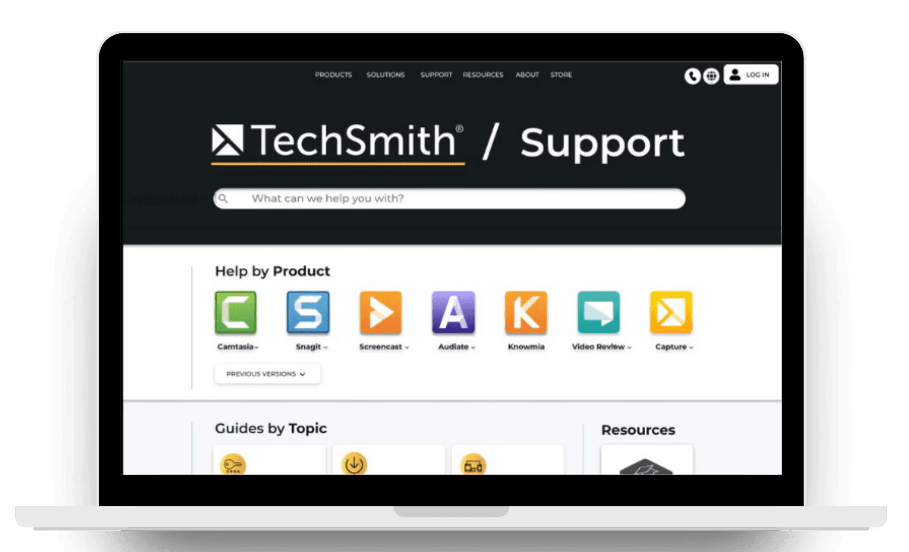
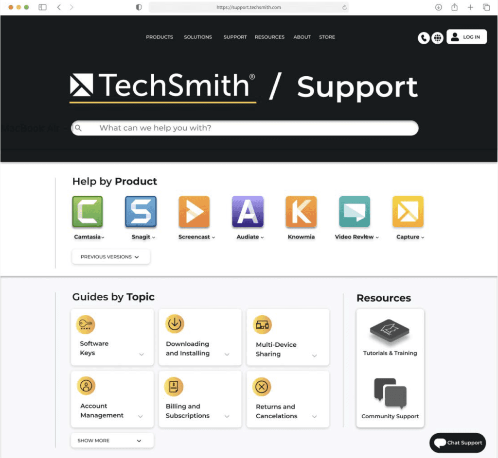
We conducted A/B testing through an online survey targeting tech-minded individuals, including the Experience Architecture (XA) community. Feedback showed that users found the redesign more organized and visually appealing, but 86% wanted all products visible without scrolling. This prompted adjustments:
Product Visibility: Ensured all products appeared on the main page.
Drop-Down Menus: Added drop-downs for easy access to information without leaving the homepage.
Guides by Topic: Added a section for frequently visited content.
Analyzing Results
Another round of A/B testing confirmed the improvements:
User Preference: 87.5% of participants preferred the new design.
Enhanced Clarity: Users noted the layout was more informative and visually appealing.
Positive Feedback: Changes like “Help by Product” were praised for clarity.
Homepage Improvements: Participants appreciated the increased visibility of content.


Survey Participant
“I feel like I know all this company has to offer without having to look elsewhere.”

Survey Participant
“Design B has a modern feel, with smoother transitions and clearer page hierarchy.”

Survey Participant
“The guides with clear names and icons help identify them easily.”
Our final design was well-received by TechSmith, meeting key stakeholder and user needs.
What did I learn?
Some key takeaways I learned through completing this project were:
Planning and Flexibility: This project had minimal guidelines, giving us students the freedom to apply the learning we had done in class to complete the project however we pleased. Although appreciating this independence, our team quickly realized this meant we held the responsibility to curate a systematic plan that would ensure we achieve our end goal of presenting the TechSmith representatives with suggestions to improve their User Experience. To achieve this, we curated a timeline and created deadlines to complete tasks. While following this plan, we encountered setbacks that challenged us to adapt and be flexible to alter our original plan to maintain on track and produce our best possible work.
User-Centered Design: Previously to this project, I had practice with Graphic Designing and completing User Research. Having experience with these tasks separately, I was challenged in this project to combine these skills, using the research, data, and client preferences gathered to guide the design. I found this process of utilizing design to find solutions to problems very fulfilling. Specifically, gathering user feedback taught me the importance of involving users in the design process since it is most important to produce designs that users find useful rather than what I may think would be useful as the designer.